ShineHub
Innovation in Motion: Redefining the Solar Experience
Australia’s solar industry was booming, but the software around it had not caught up.
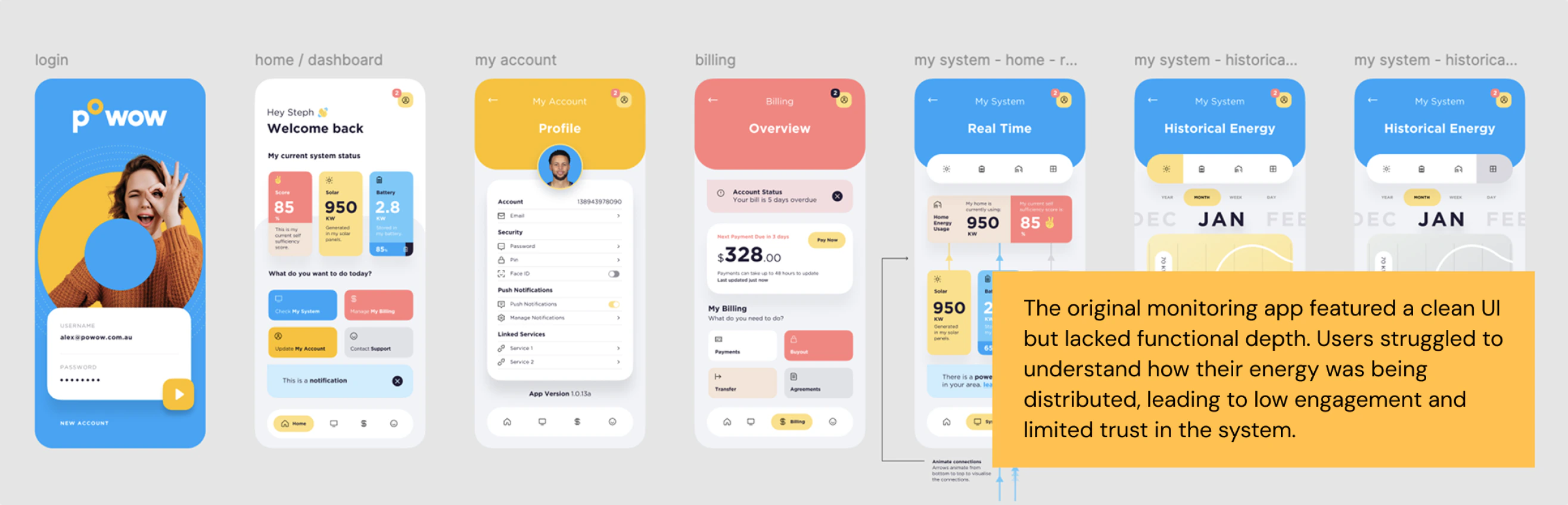
ShineHub had tens of thousands of customers and a rapidly growing Virtual Power Plant. Its existing app could not keep pace: delayed data, confusing graphs, no reason to open it, and no way for homeowners to see whether their solar was actually making a difference.
As lead designer, I owned the product design process end to end—research through UI, prototyping, testing, and developer handoff—working directly with the CTO and Engineering to define the vision and prioritise what got built.
No way to see if their solar was actually making a difference.
I started with a full audit, stakeholder workshops, and user interviews. A diary study surfaced when and why homeowners actually opened the existing app, and how—or whether—it fit into their daily routine.
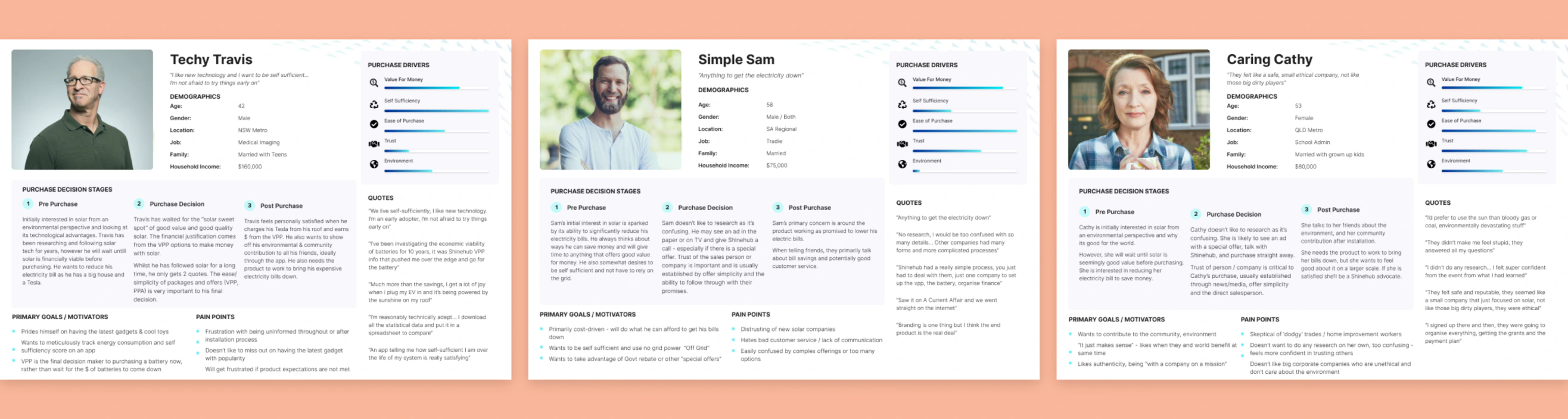
The research produced three personas, each with a different relationship to technical literacy and motivation.
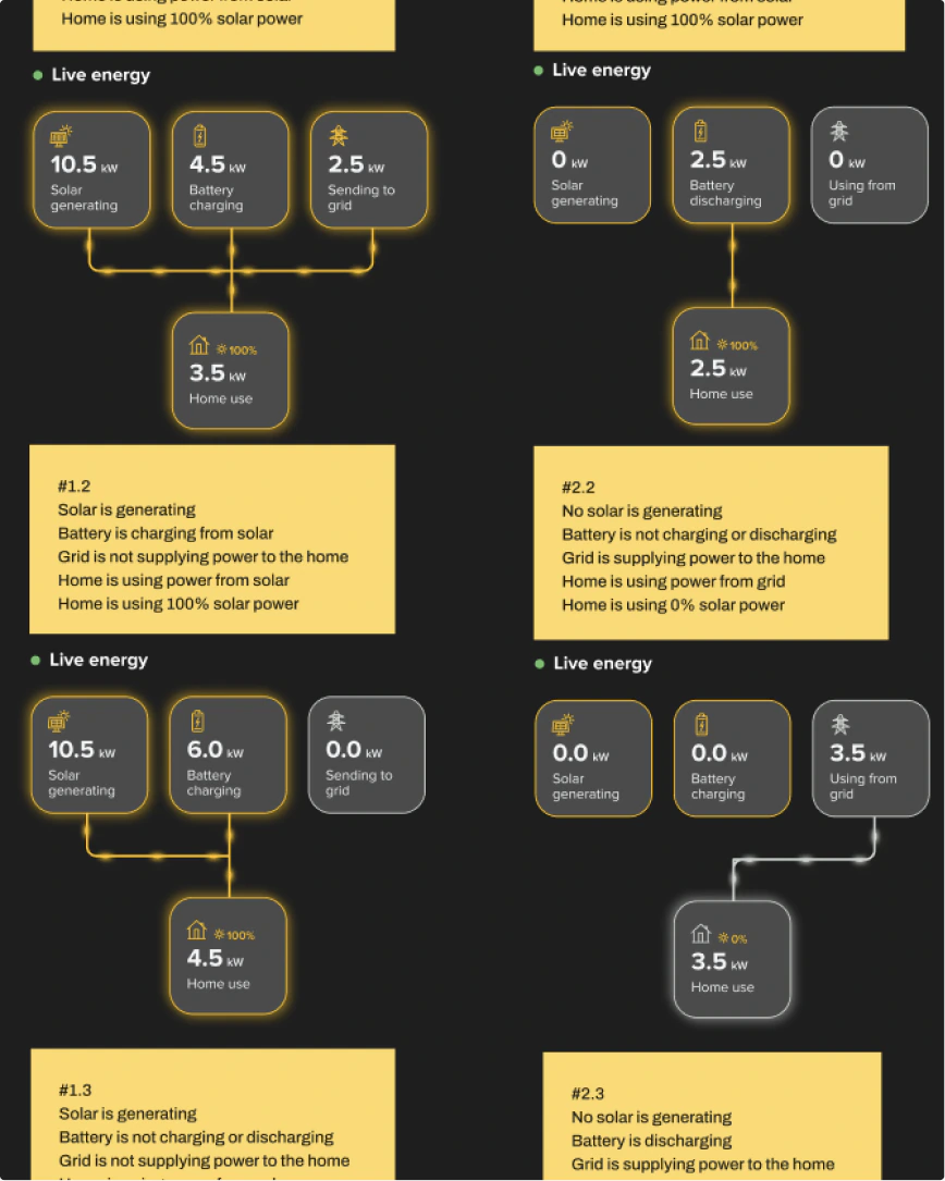
A Jobs-to-Be-Done approach mapped every energy scenario a homeowner could hit, from a cloudy day to a grid sell-back, so the app had to work for real situations rather than an idealised one.
Generation, storage, and grid-sharing were technically accurate and humanly meaningless. Nobody could feel what their energy was doing.
The data was technically accurate and humanly meaningless.
Turning raw data into bite-sized moments.
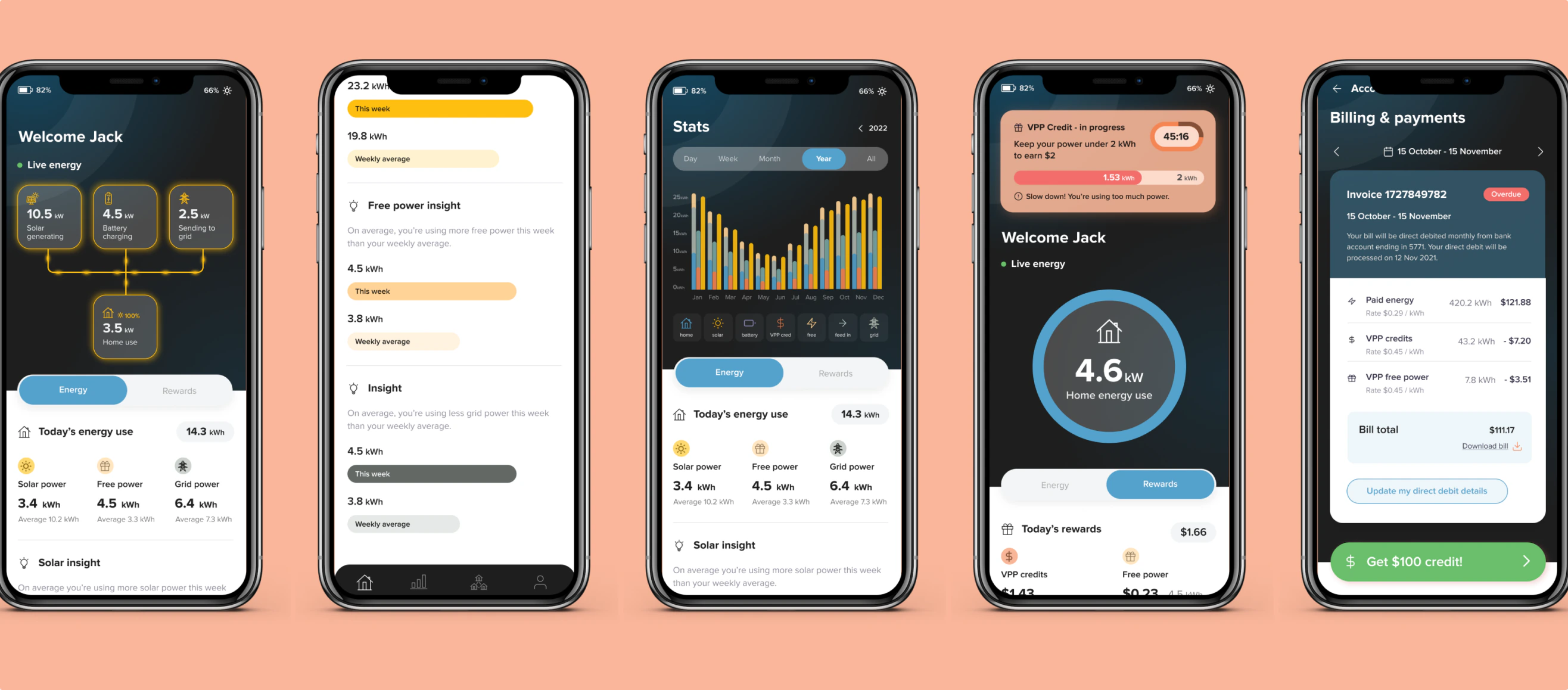
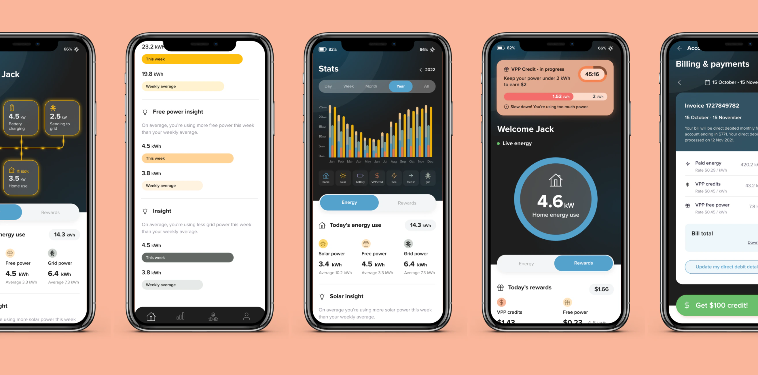
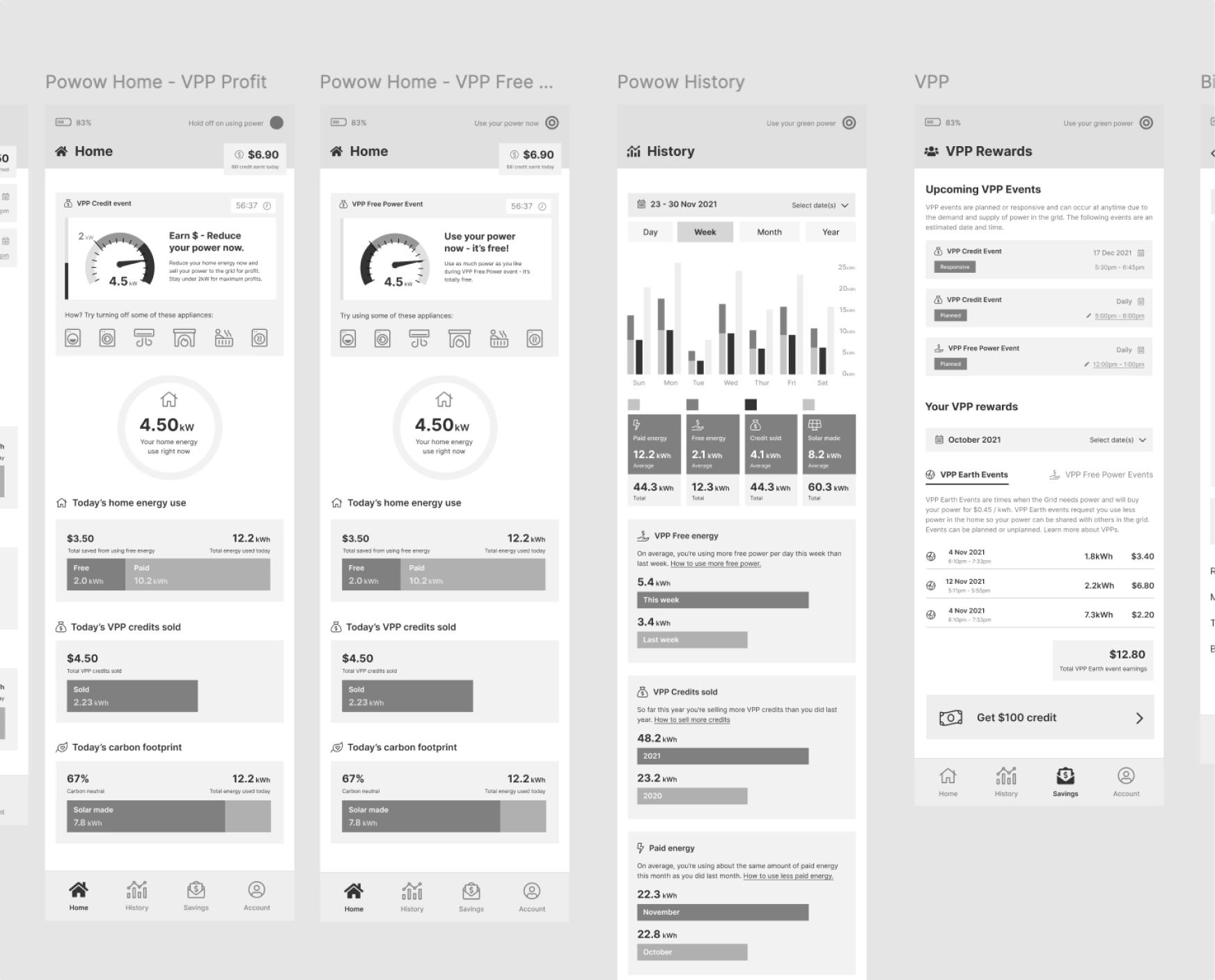
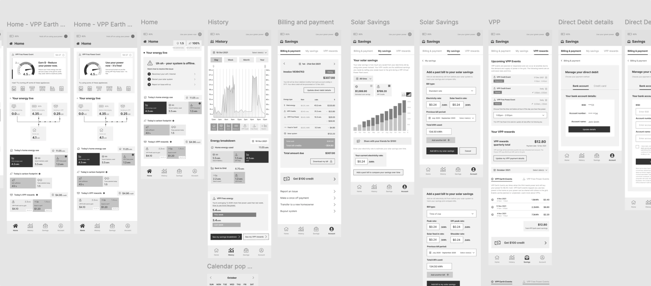
I sketched, wireframed, and prototyped multiple flows for how power actually moved through the home, battery, and grid. The goal was to make an invisible system visible without turning it into a dashboard.
Two ideas came out of that as the core bets: an energy insights feed, turning raw data into bite-sized moments, and a first-of-its-kind visual system telling users exactly when to cut power to earn more money.
Translating business needs into what was technically realistic.
There was no Product Manager on this project, which meant scoping, sequencing, and negotiating deliverables fell to me by default, not by design.
I worked closely with Engineering to understand what was actually buildable and pushed for a staged rollout.
That meant a lot of back-and-forth with the CTO and engineers, translating business needs into what was technically realistic and translating technical constraints back into what the business needed to hear.
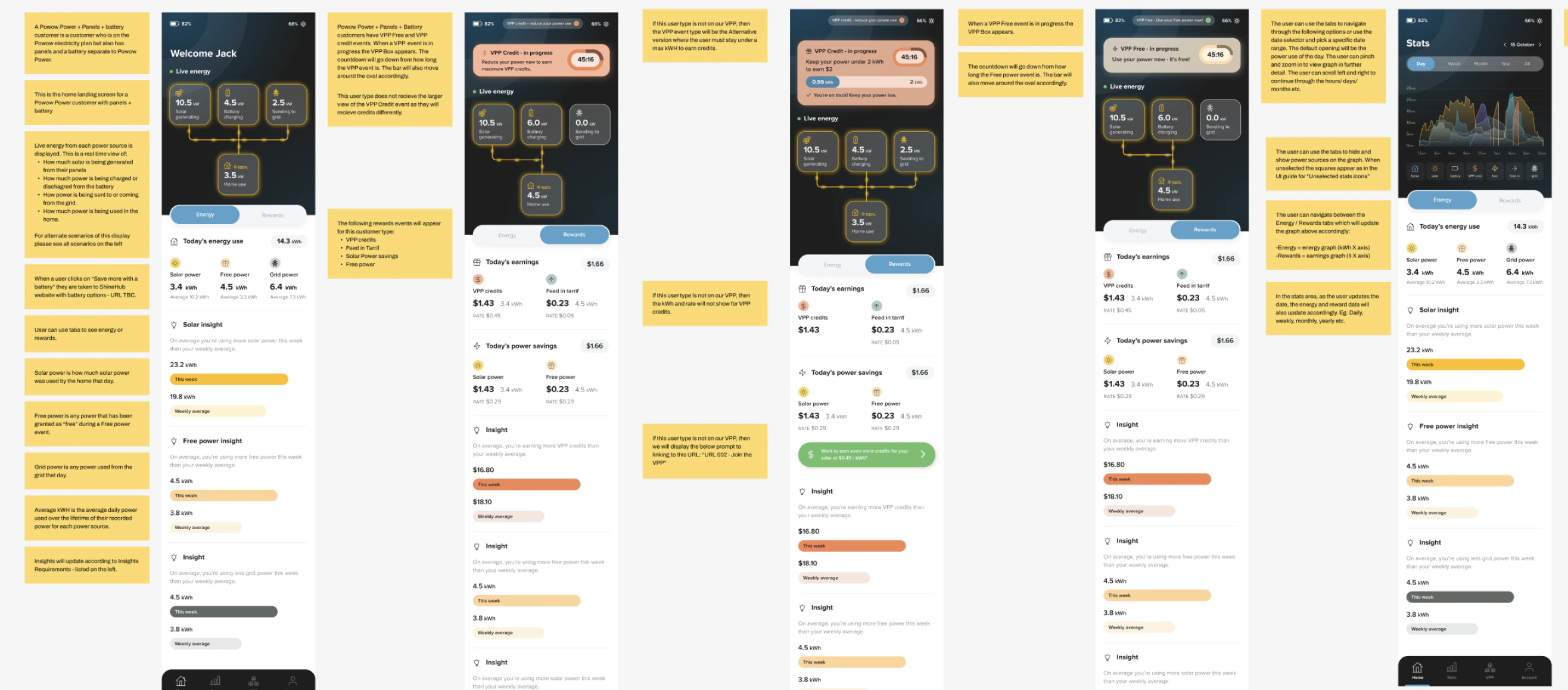
I validated with usability tests across every persona, focused on data comprehension, navigation, and emotional response to energy events.
Based on what came back, I refined terminology, hierarchy, and colour cues—the unglamorous iteration that moves comprehension and trust.
More than the numbers, the work shifted the product from passive monitoring to something homeowners actually felt part of.
The kind of unglamorous iteration that moves comprehension and trust.
Post-usability testing and beta tracking.
- 45% improvement in comprehension speed
- 1.8× increase in daily engagement
- 92% task-success rate across key scenarios
More than the numbers, it shifted the product from passive monitoring to something homeowners actually felt part of—a product they could understand and trust.