

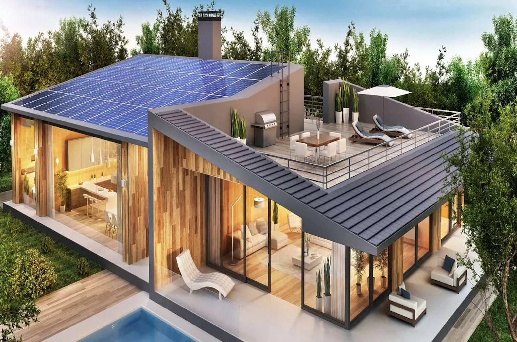
Smarter energy for everyone.
When solar first hit the market, a string of solar companies released basic monitoring with inaccurate, unhelpful and slow information for users.
I was the lead Product Designer for the ambitious project to create an all new energy monitoring app that served to transform the way people use, and even profit from, the clean energy in their home.
To comply with my non-disclosure agreement, this case study is strictly confidential and solely for the use of the recipient and may not be reproduced or circulated without my written consent. All information in this case study is my own and does not necessarily reflect the views of the organisation.
The challenge.
In just five years, our organisation grew their solar and battery customers to tens of thousands of customers across four states in Australia.
By 2021 they had also developed a Virtual Power Plant, whereby customers in-home batteries are connected and can share and sell power to the grid during peak times or in need.
The introduction of a number of moving parts to a complex system of generating, using, sharing and selling energy meant a need for transparency as well as simplicity for the modern homeowner trying to understand how their solar products where helping them, their community and world at large!

The goal.
Our goal for the app was to make it easy for the average homeowner to understand their energy from all angles and see how they were contributing to a cleaner and cheaper way of living and inspire them to spread the word.
High level goals were:
Make it simple and easy for all types of homeowners to quickly see and understand their energy overview - real time and all time.
Give homeowners more detailed insight as to how, when and why their energy was being used and how they were making money.
Create a platform for deeper engagement with our organisation and inspire a greener community at large.
My role.
I was solely responsible and led the product design from research through to wireframing, UI, prototyping and development requirements.
Planning & Scope Definition
I defined the product with the CMO and partners of the business. I synthesised customer goals and balanced business goals. I prioritised and negotiated features for launch and beyond.
User Research & Ideation
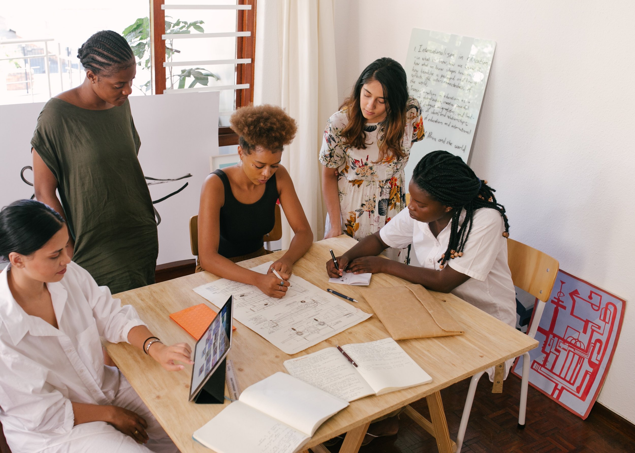
This was my third major project for this organisation so we were able to utilise my previous research conducted on our audience and translate these insights into features that applied to this new project. For this app I conducted more specific interviews surrounding the existing app as well as a diary study.
Design Execution & Validation
I designed customer journeys, wireframes, user interface, prototypes and design specs.
Leadership
I designed up and presented works to gain buy‐in from executives, senior stakeholders and many other internal teams throughout the project lifecycle. I liaised with developers to ensure its smooth development and testing.
Kick off.
A basic app with very few pre-existing insights.
At the start of the project we had an idea of what our customers wanted based on previous projects and years of talking with our customers but had no specific details on exactly what and how our users needed within the app itself.
I first met with internal stakeholders to gather business requirements and their objectives for the short and long term role of the app for the business.
Management saw the app as not only a tool to assist users in their energy monitoring but a long term way to engage with customers and create a strong brand alignment and affiliation. The app was to give users a daily feeling of helping themselves, their community and climate change, and our organisation was facilitating this.
The pre-existing monitoring app, designed by the previous designer as a basic intro to monitoring their solar system. However the app was not well received and didn’t provide users the in-depth understanding most users were looking for.
The research.
Powow had an existing app which was very minimal and only a small number of users were actively using it. However this served as a great base to understand how users were currently using it, their issues, expectations and frustrations to form requirements for the new app.
We interviewed a selection of the existing app users to discover their habits, attitudes, motivations, behaviours and expectations. We also conducted a diary study to collect qualitative data of their behaviour over time.
What we discovered was how cluey our homeowners were and how much information they thought they wanted.
Core findings.
The existing app gave us some insight into what current users initial expectations and behaviours were after a few months of use. Homeowners wanted information about their energy use to be in real time and be highly accurate.
Content Basics
The diary study and post interview feedback gave us core content requirements for the app to include basics such as:
How much solar is being produced
How much power is being used in the house
How much charge is in the battery
How much power is being used from the grid
How much power is being sent to the grid
A key insight from this study came the fundamental reason as to why homeowners were checking the app and that was to lower their electricity bills by knowing exactly when to use and not use the appliances in their home.
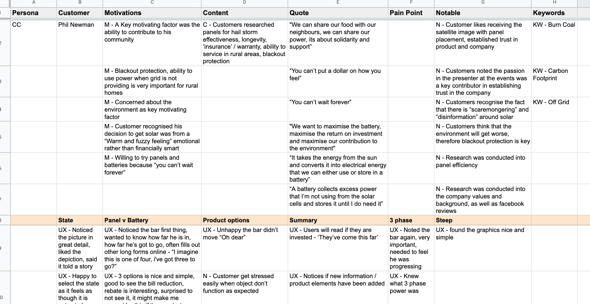
Research from the post diary study feedback was sorted into core findings groups to easily and accurately assess exactly what users wanted, not just what they said they wanted.
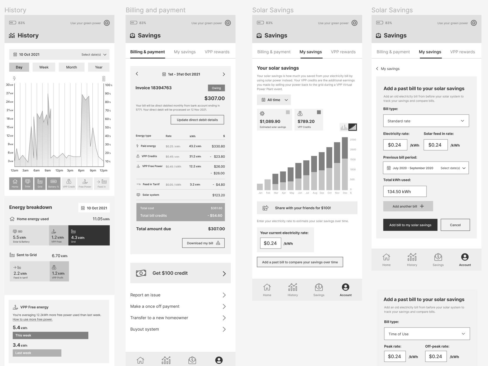
Money.
Whilst users were aware of the purpose of the app as generally for monitoring energy use and comparing it to their solar production, homeowners pointed out the critical need for energy bill savings and cost comparisons within the app.
Users wanted to know exactly how much they were saving each month. How much they were spending and exactly what to do in order to save and earn more.
The need for a section of the app where users can access this type of data with as much accuracy as possible was identified and would then be raised internally as to how we could achieve this logistically.
Design & functionality insights.
Key feedback from a multitude of users, when it came to the design of the app, were conveniently aligned. The feedback was around the need for simplicity, data in real time, easily recognisable symbols, reliability and speed.
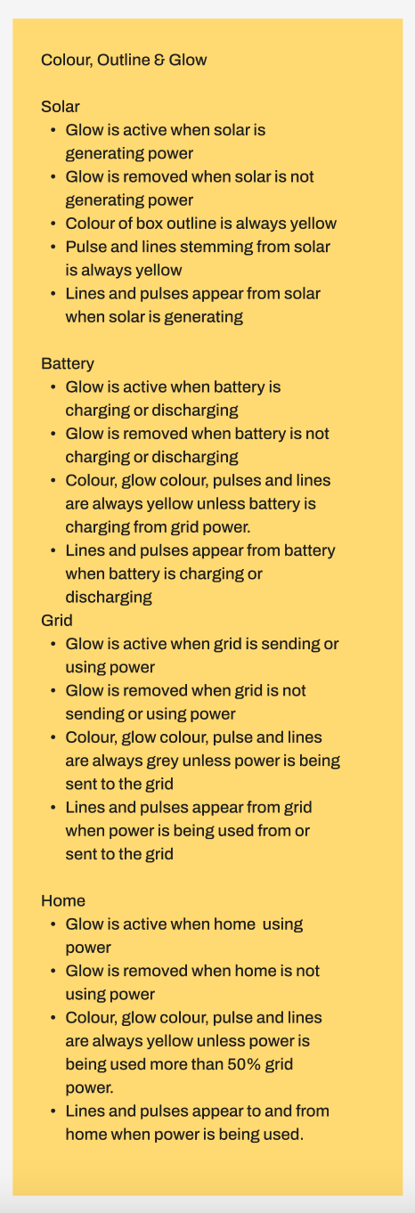
Interestingly, the colour theory that had been previously applied, caused significant confusion when it came to deciphering meaning of certain functions within the existing app. The previous designer had randomly applied colours to buttons not specifically relating to function, which proved to be a critical issue for the users.
Research also told us that users were checking the app either multiple times per day or on a weekly basis. They were also checking the app depending on a number of factors such as weather, seasonality or simply curiosity.
From this extensive research we developed our core requirements for the app and discussed how feasible each feature was to logistically implement.
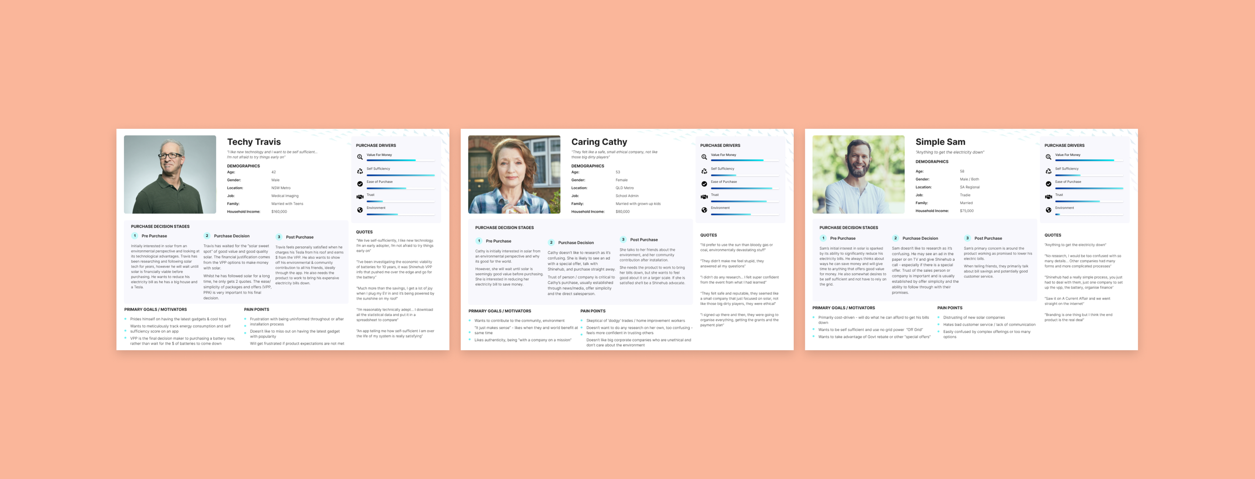
Previous research I’d conducted on another product we built also gave us our core User Personas, of which we could apply to this project.
Design - UX Wireframing.
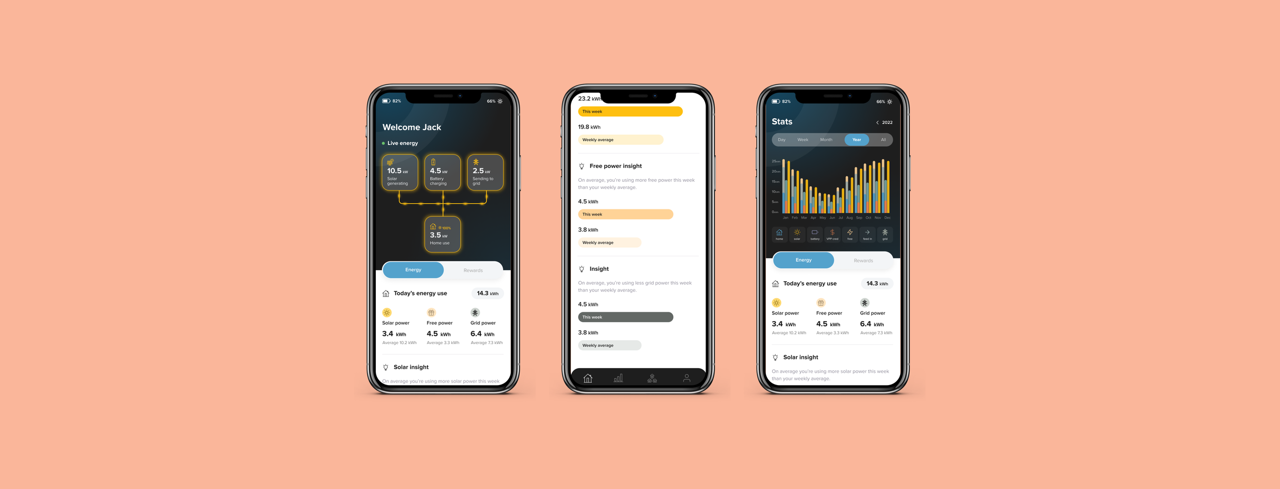
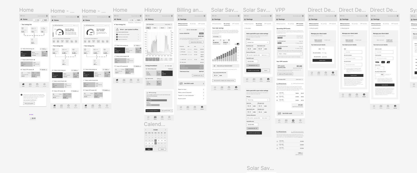
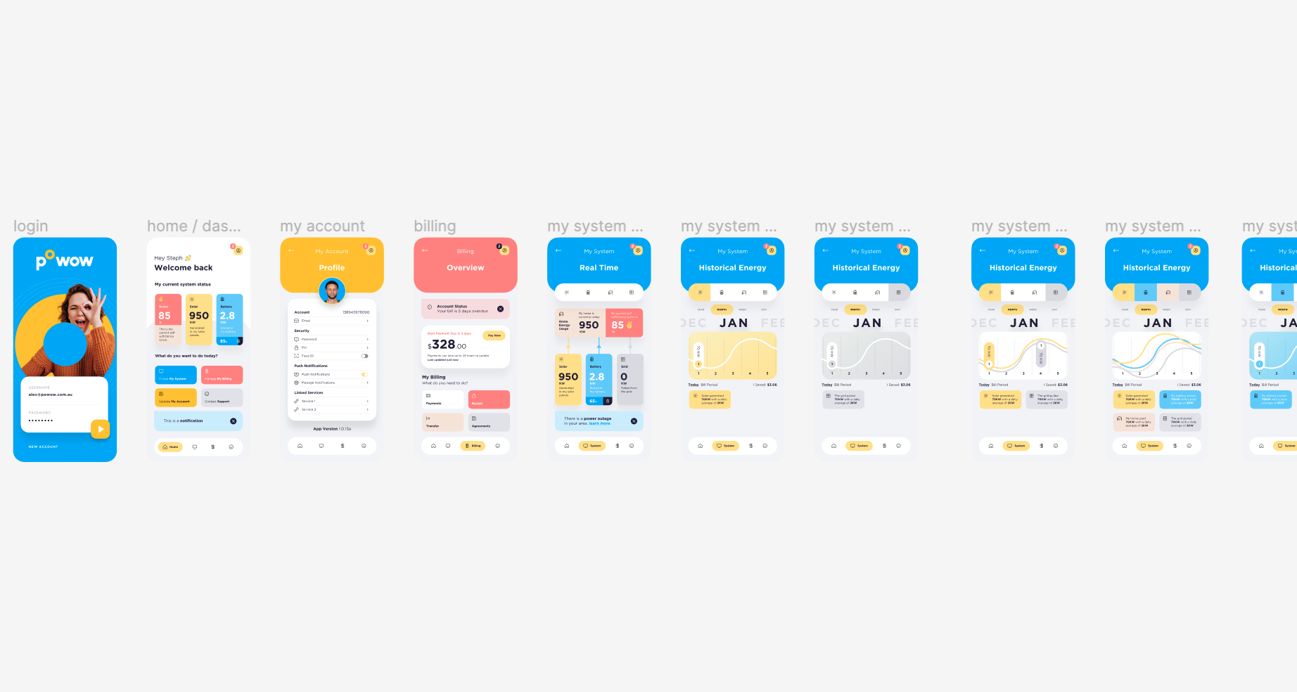
And so began design phase! Starting with the wireframes, I first sketched by hand a few random ideas when it came to important features such as the graphs and what the critical homepage view of the power moving in and out of different parts of the home.
As there were so many parts of the app that needed to come together, I like to sketch out the critical pages, then bring them into reasonable high fidelity which helps me start visualising the rest of the app. Once a few core screens are built, I can then quickly visualise and iterate the rest of the app.
When working with other designers I like to have no discussions about design, but employ a ‘first thoughts’ method of having designers go away and simply come up concepts and first designs in a sprint style method of a few hours max. Once we each have some design concepts, we bring them together to compare and select the elements we like from all the concepts. This method broadens the potential for truly innovative and new designs that still adhere to well researched UX practices.
Unfortunately it was just me on this project so I did my best to come up with several different concepts and compare with my manager on our favourite parts of each.
Design - Concept mapping.
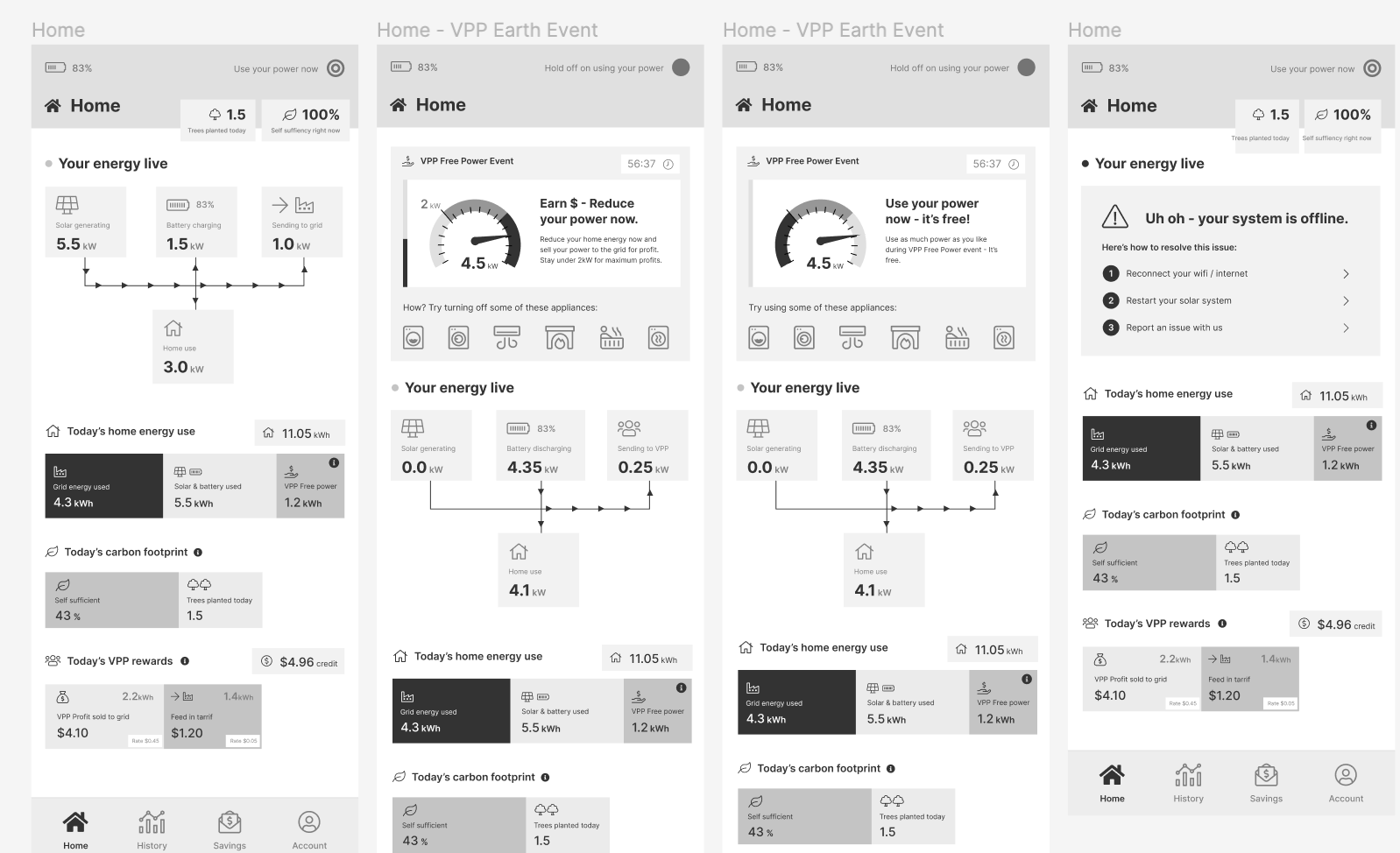
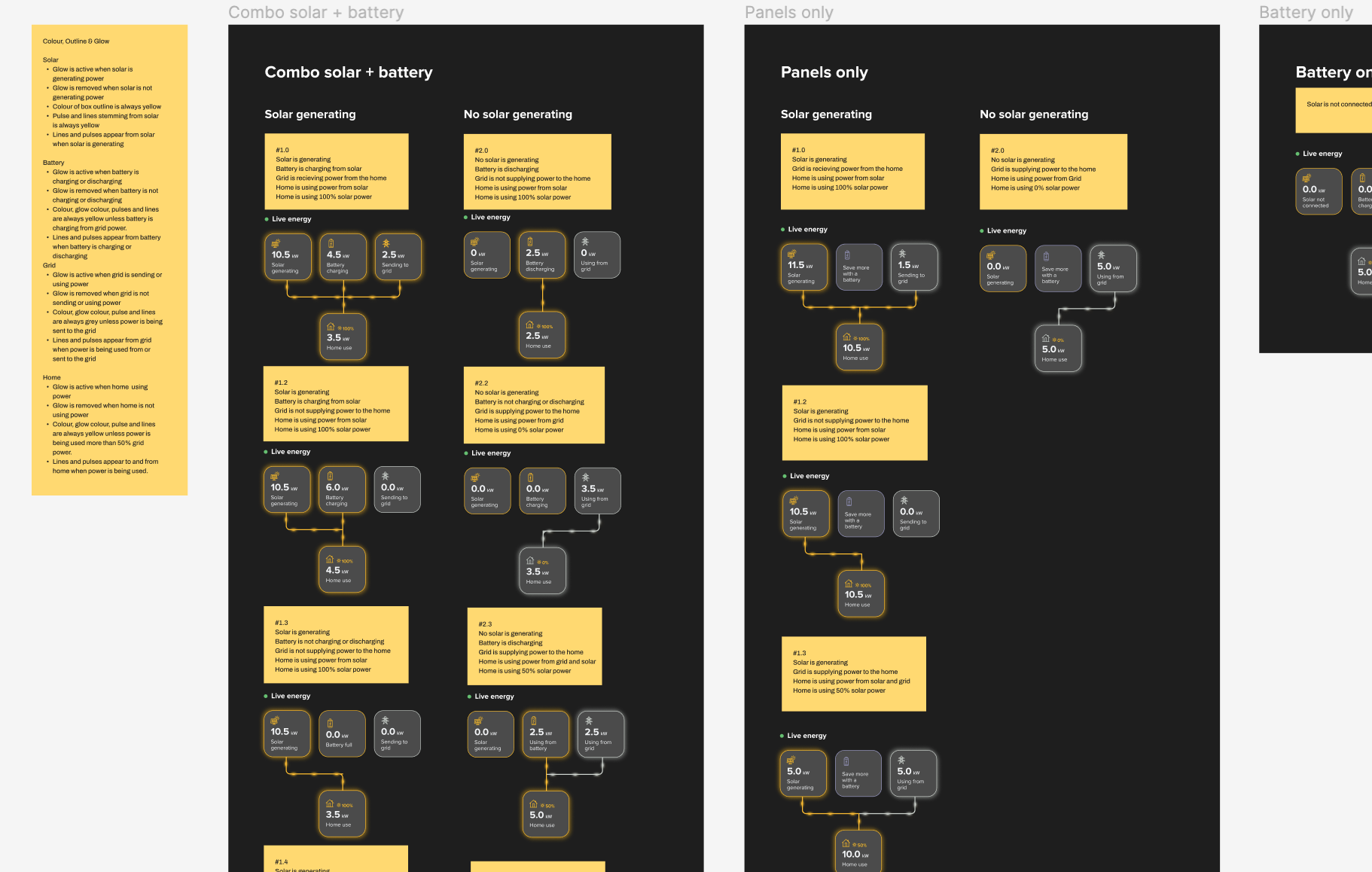
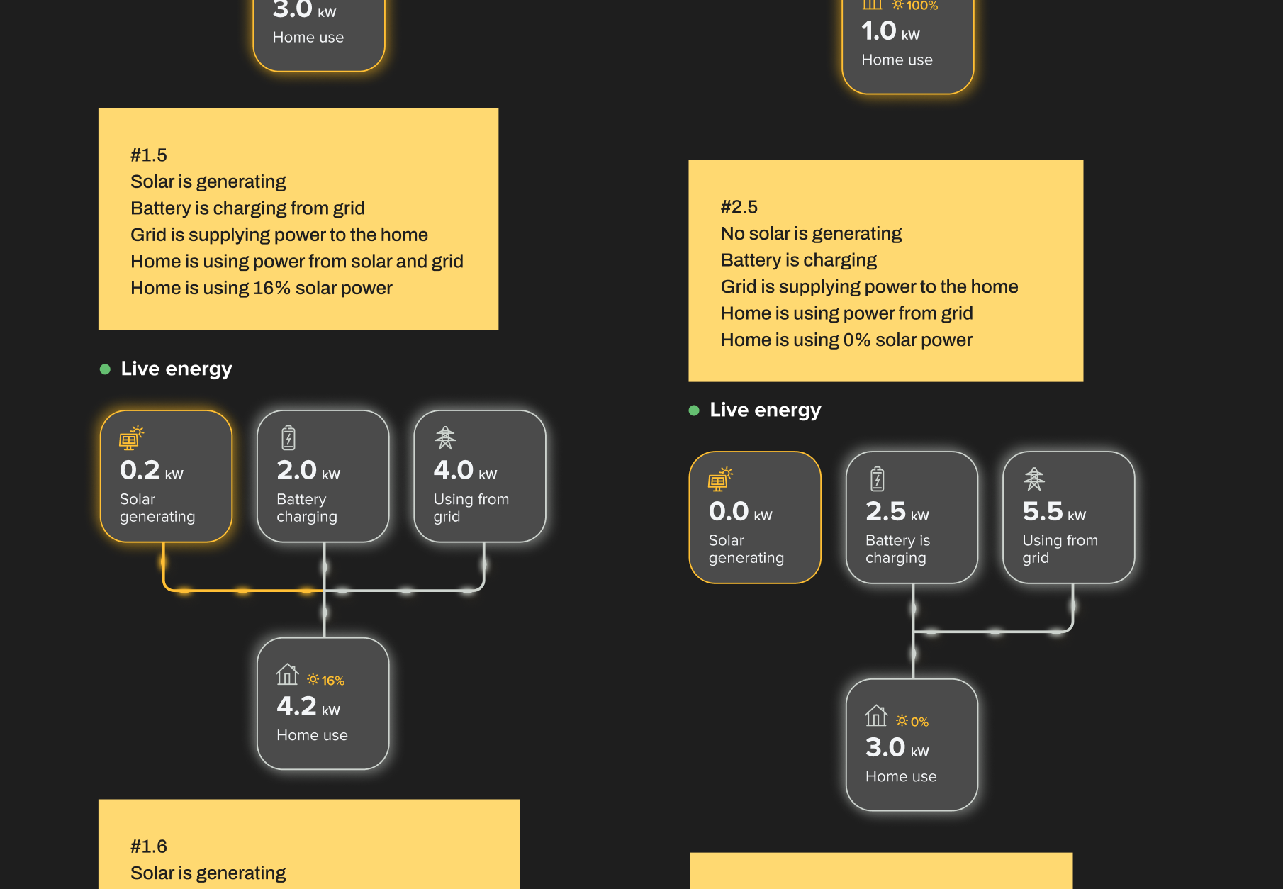
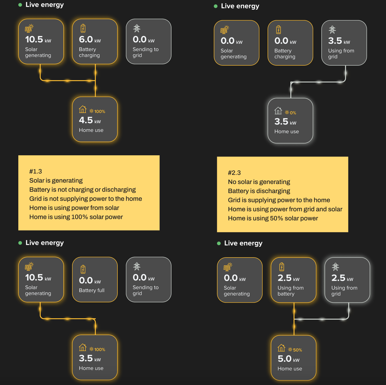
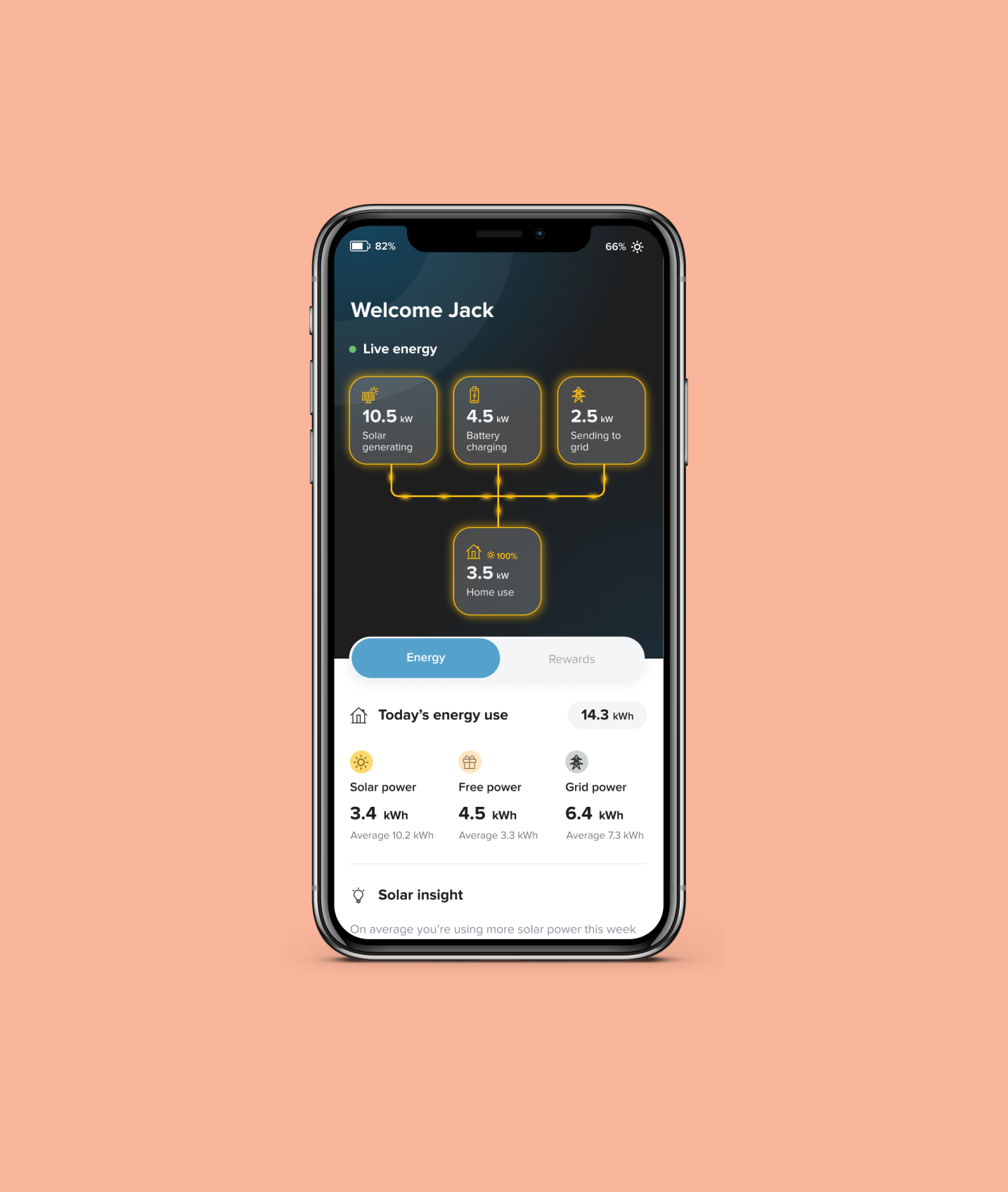
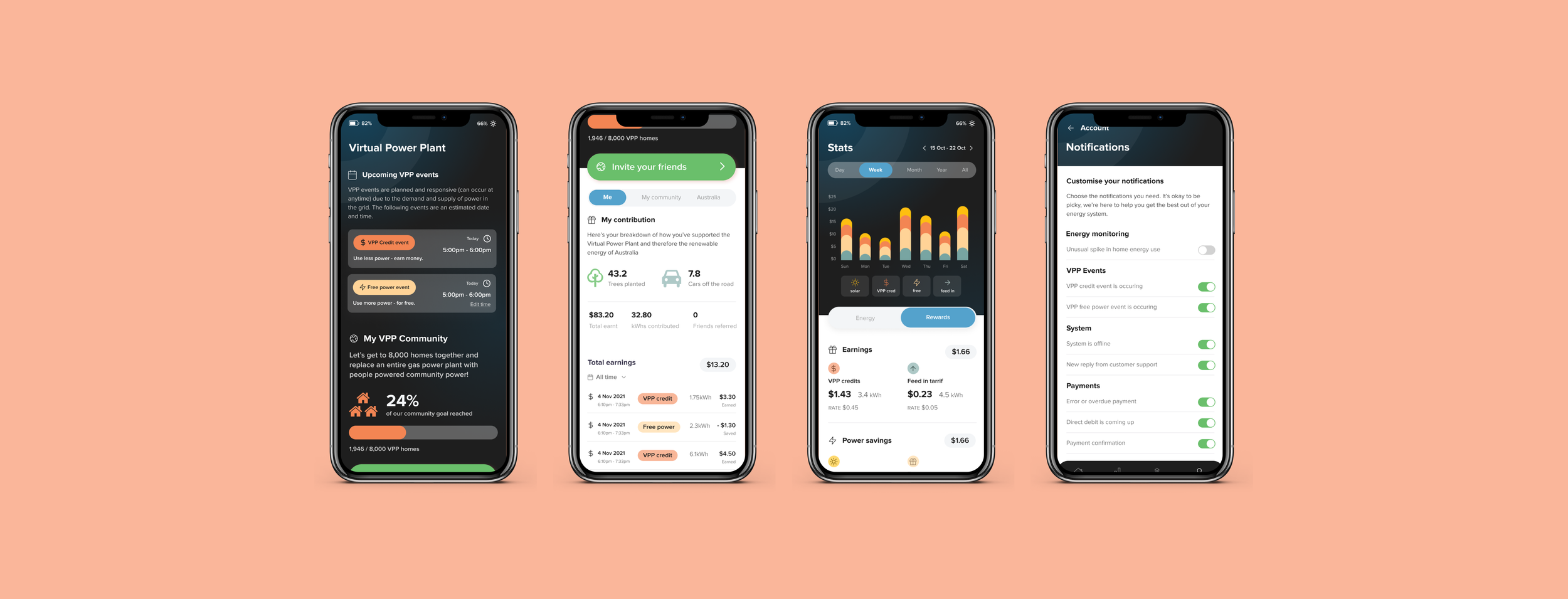
The four key elements of power distribution were the solar panels, the battery, their home energy use and the grid. Because there were so many different scenarios around how energy moves through each element, mapping out this process became a vital part of the process and allowed us to see how many moving parts of the app there needed to be.
Mapping out this process allowed us to visualise how a user would see and react to each scenario and also gave us insight as to what the user needed from this.
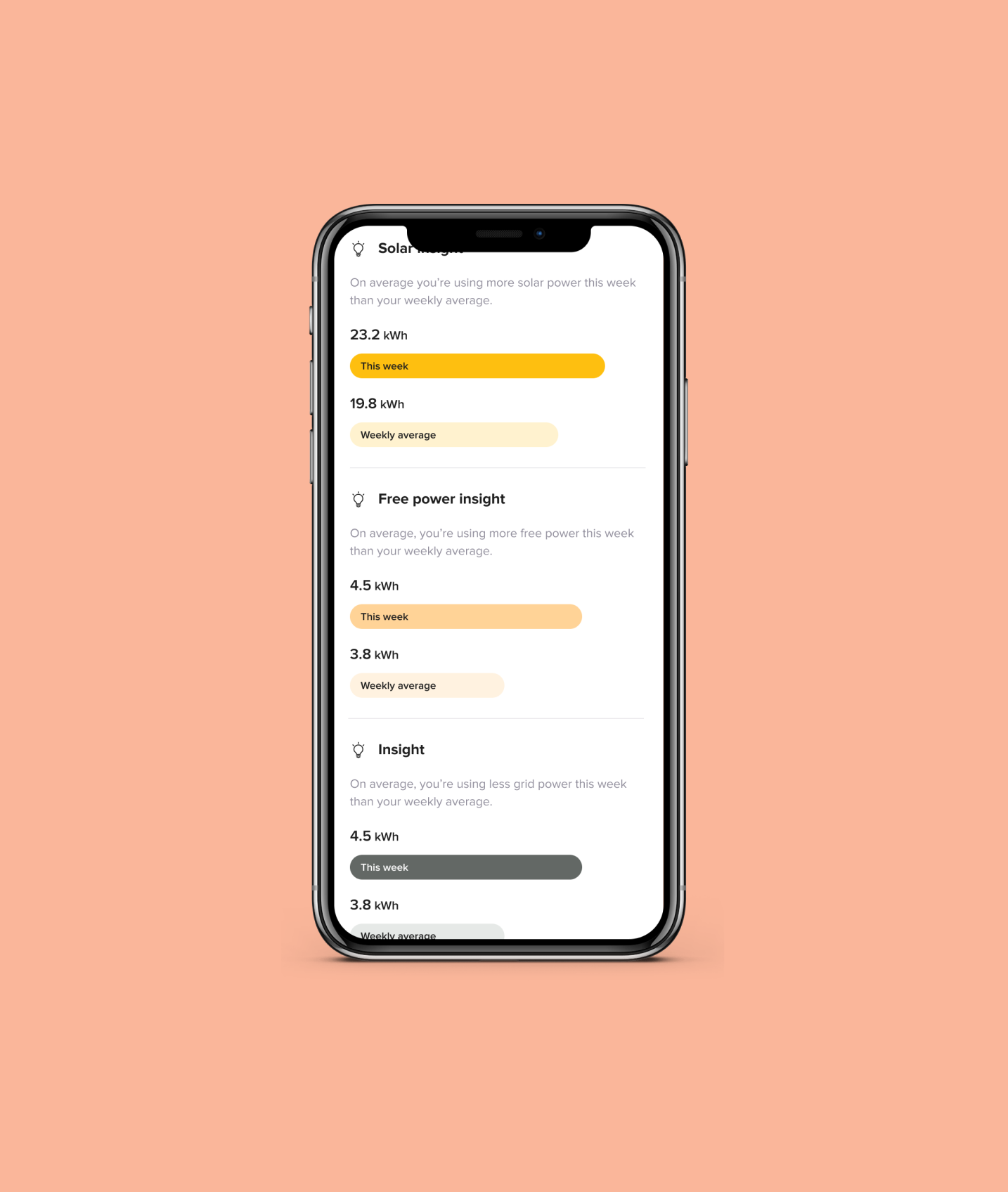
From this process, I came up with the “insights” feature of the app to act similarly to the ‘Health’ app of the iPhone, that offered interesting, helpful and exciting information.
Design - UI.
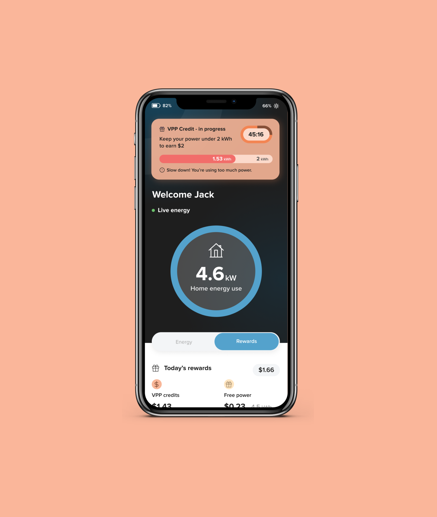
Another challenge was communicating to the user on when to use or reduce power in their home to earn money by sending power to the grid during a Virtual Power Plant (VPP) event. After a number of iterations we came up with the below concept whereby a user could see a countdown as well as a pill style bar filling up with the power they were using and easily see when to slow down or stop.
After testing this concept with a number of subjects we were happy the concept had be proven correctly.
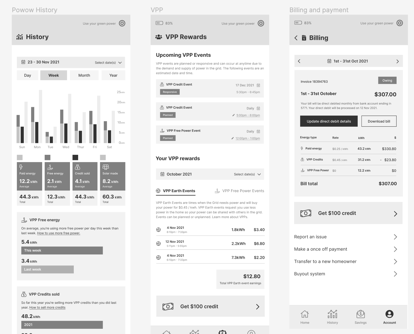
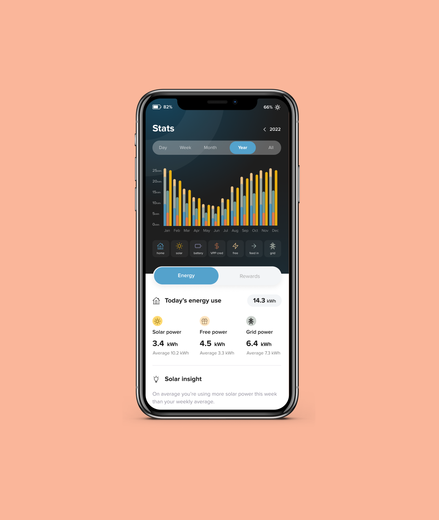
Next was our graph visualisation of power sources. After research showed us that users were interested in seeing the history of power use in a general sense, we decided to omit the feature which gave user the ability to select specific date ranges but rather give users the option to view by day, week, month or all time. A simple bar style graph with the ability to switch on and off which source they wanted to view proved to be the most effective option.
Design - UI.
Each page of the app we scrutinised and went through several rounds of iteration. Having only one designer had it’s pros and cons but did allow for quick review and quick fix! Once we had prepared our core screens we did mini tests with interview subjects to ensure functionality was communicated.

App build - in progress.
As this was my recent project we are still in progress for the build. I work closely with developers to ensure each part of the app is built the way it was designed. From micro animation to each of the 23 scenarios function accordingly, our close team is able to ensure the app is built to last.
Following the build and testing we would launch to Beta and conduct further testing to then plan for our next version.
I hope you enjoyed this case study!