


Bringing renewables online
From what was once an industry dominated by door to door salesman and a lengthy installation process, solar has been slowly shifting to a quicker, easier and more transparent way to get affordable, reliable renewable energy in sunny homes across Australia.
I was the lead Product Designer for a Clean-tech organisation, tackling the brand new task of enabling users to shop and order renewable energy online.
To comply with my non-disclosure agreement, this case study is strictly confidential and solely for the use of the recipient and may not be reproduced or circulated without my written consent. All information in this case study is my own and does not necessarily reflect the views of the organisation.

The challenge.
Solar panels aren’t new to the mass market, however the way in which people purchase them is just as old when they were first introduced. The other product making an entrance into Australia is in-home batteries, to store the power generated by the panels for use at night when the sun is no longer shining.
The challenge was epic and our organisation wanted to be the first to shift the industry from in person, to phone, to then bring the entire process online.
When I first joined the organisation my initial recommendations in tackling this cultural shift was to first dive deep into research on who were our core customer groups and what were their motivations, pain points, values and pathways to going solar. Only then could we re-invent a model that would allow for serious scale.

The goal.
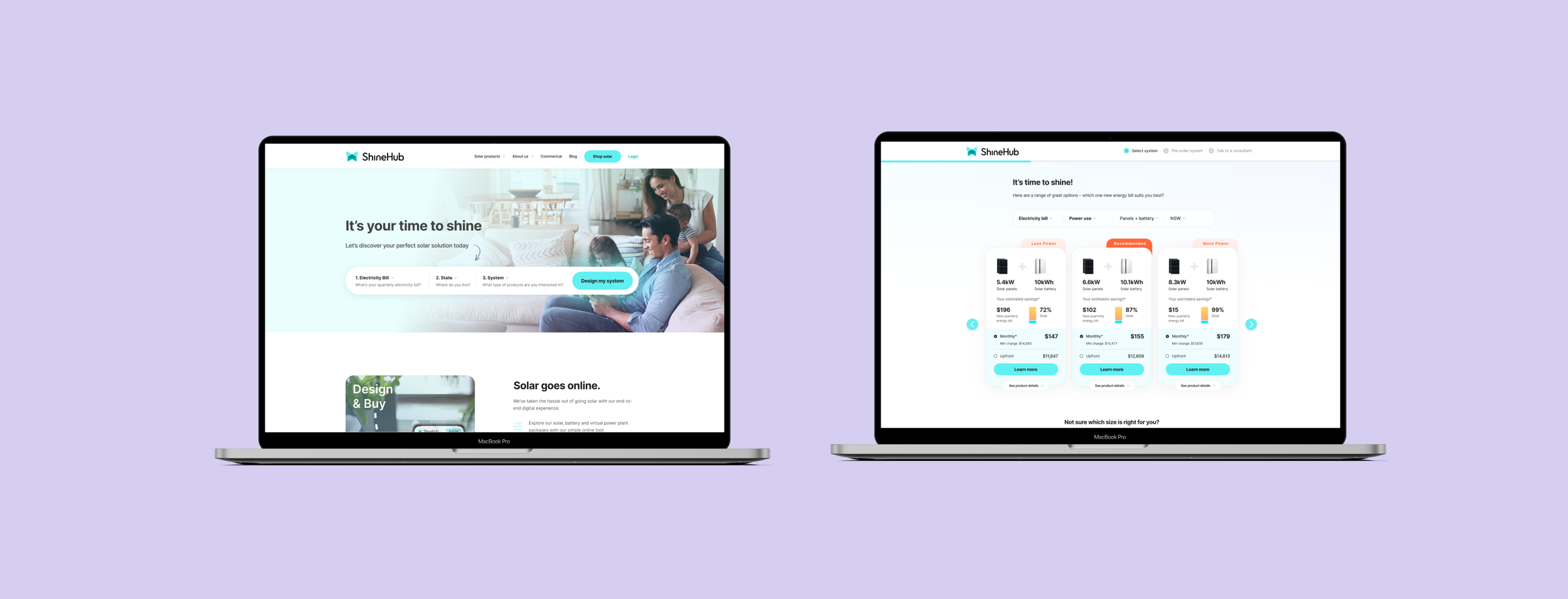
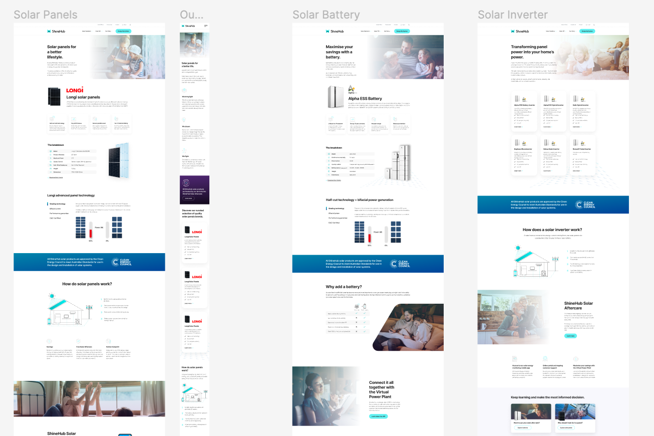
Our goal was to create a website and ordering flow that not only allowed but encouraged the average user to browse and discover the solar solution that perfectly fitted their home, to then order their system online, without any direct human assistance. This idea had not yet been undertaken successfully in Australia.
High level, I defined our goals as:
Create a shopping and ordering flow in which users feel comfortable and excited to move through to discover the system that is right for them.
Build trust with the audience and allow them to move through the flow and order a system online
Create a full website for the solar company to aid in building trust in the organisation
My role.
I was solely responsible and led the product design from research through to wireframing, UI, prototyping and development requirements. I then continued to work on this project and test and reiterate the designs for the following year.
Planning & Scope Definition
I defined the product with the CMO and partners of the business. I synthesised customer goals and balanced business goals. I prioritised and negotiated features for launch and beyond.
User Research & Ideation
This was my first project for this organisation so we needed to be thorough in discovery, and dedicate significant time into research as this would set the foundation for all future products. Internal interviews and User Interviews were the core method to be undertaken, to enable both quantitative and qualitative findings to help define next steps and the first design iteration.
Design Execution & Validation
After research I was responsible for turning our findings into personas, customer journeys, wireframes, user interface design, prototypes and design specs.
Leadership
I designed up and presented works to gain buy‐in from executives, senior stakeholders and other internal teams throughout the project lifecycle. I liaised with developers to ensure its smooth development and rollout.
Kick off.
As a startup, my organisation was founded by someone who had been working in the solar industry for over 15 years. From sales through to senior management, the founder had a very good understanding of the type of customers solar appealed to, but did not have any defined evidence or documentation to support his ideas. We needed to combine his knowledge and assess the current market in Australia with a more focused approach.
I broke down the research into three key phases. Internal understanding, core interviews and research synthesis.
The research.
Starting from scratch.
When I first entered the organisation I had an overwhelming amount of first hand information given to me, however these initial insights needed to be defined and validated. After these first few casual meetings with the founder, I was able to plan out the interviews and being developing interview questions for key internal stakeholder groups - upper management, the sales team, the customer service team and installation teams.
I then conducted these interviews over several weeks, talking with five or so people from each team. Each interview was recorded, dictated and then analysed immediately after. From this I had a much more comprehensive idea of who the customers were as well as their notions of “what they said they wanted vs what they actually wanted” - a critical understanding that can usually be discovered from interviewing not only the users but the people dealing with the users as well.
A interesting insight that came from these studies was how much “the environment” factored into a user’s decision to ‘go solar’. Almost all internal interview subjects, sales to customer service, confirmed the notion that “going green” “helping climate change” and “saving the world” was simply an added bonus for 90% of customers going solar and did not influence their final purchasing decision. Instead other factors, such as saving money on their energy bills, was a significantly more important consideration.

The user interviews.
After conducting the internal interviews I then established the core demographic groups of who we needed to talk to next. Identifying three core groups, I then developed the interview script and began contacting interview subjects, which were taken from the existing database of our organisation’s customers.
Myself and an assistant interviewed around 5-7 of each group which led to some very interesting findings and the development of our three core personas. After each interview I scoured through the transcripts and sorted all feedback into several divisions to turn feedback into practical research findings and design ideas. The groups included context, motivations, content, quotes, pain points and notable.
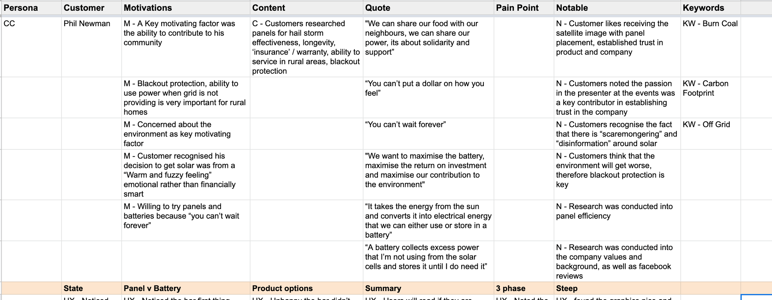
To synthesise research I transcribe every word of the interview then go through each point made by the subject and sort it into categories that are relevant to our goals from the research. From here we can view all the information clearly and spot trends to validate common ideas held by the participants
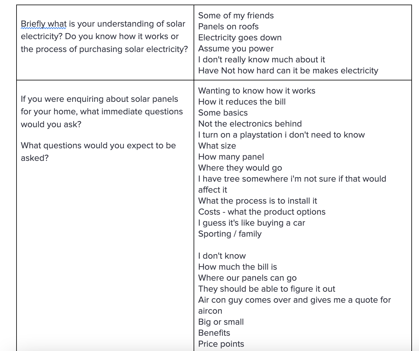
A snippet of the interview questions and their direct responses at the time of the interview - to be transcribed after
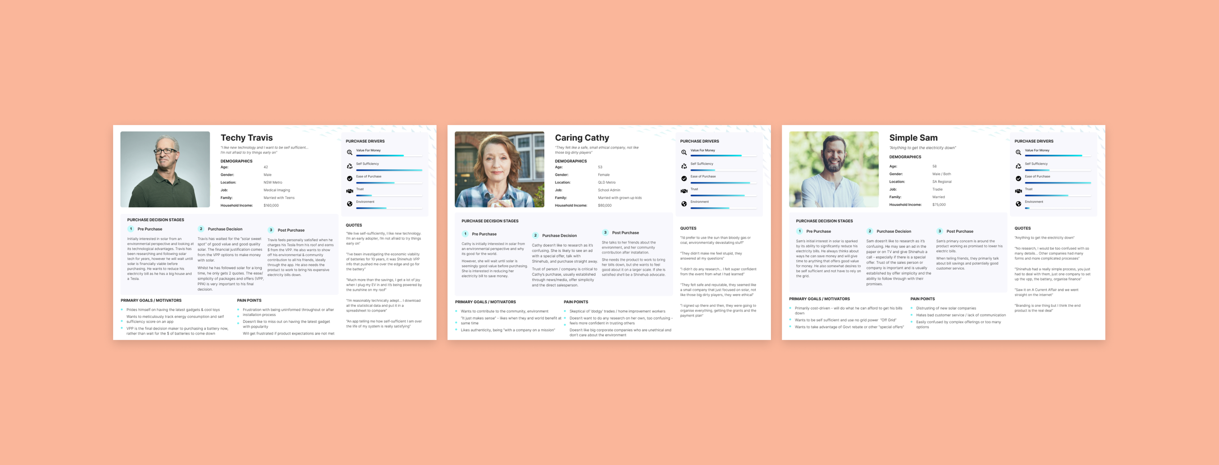
The personas.
The development of the personas was a great exercise in understanding our user and their needs at each stage of the buying journey. The research findings led us to create three core user personas of which almost all interview subjects fit neatly into. We were also able to identify how important each of the 5 purchase drivers was to them and henceforth shape the UX accordingly.
The differences of the personas meant that we needed to cater to each persona whilst simultaneously prioritising the simplicity of design for “Simple Sam”. Simple Sam represented the largest percentage of users and this persona’s needs were the most simple with regards to ‘value for money’ and ‘ease of purchase’ being the most important purchase drivers. In short, Simple Sam wanted a great deal, that was easy to do and fast to process.
Techy Travis on the other hand was much more focused on the technical specifications of the products or the breakdown of how it was an economically viable option. Whilst Caring Cathy prioritised trust so these trust factors needed to come across on the site and in the online ordering flow.
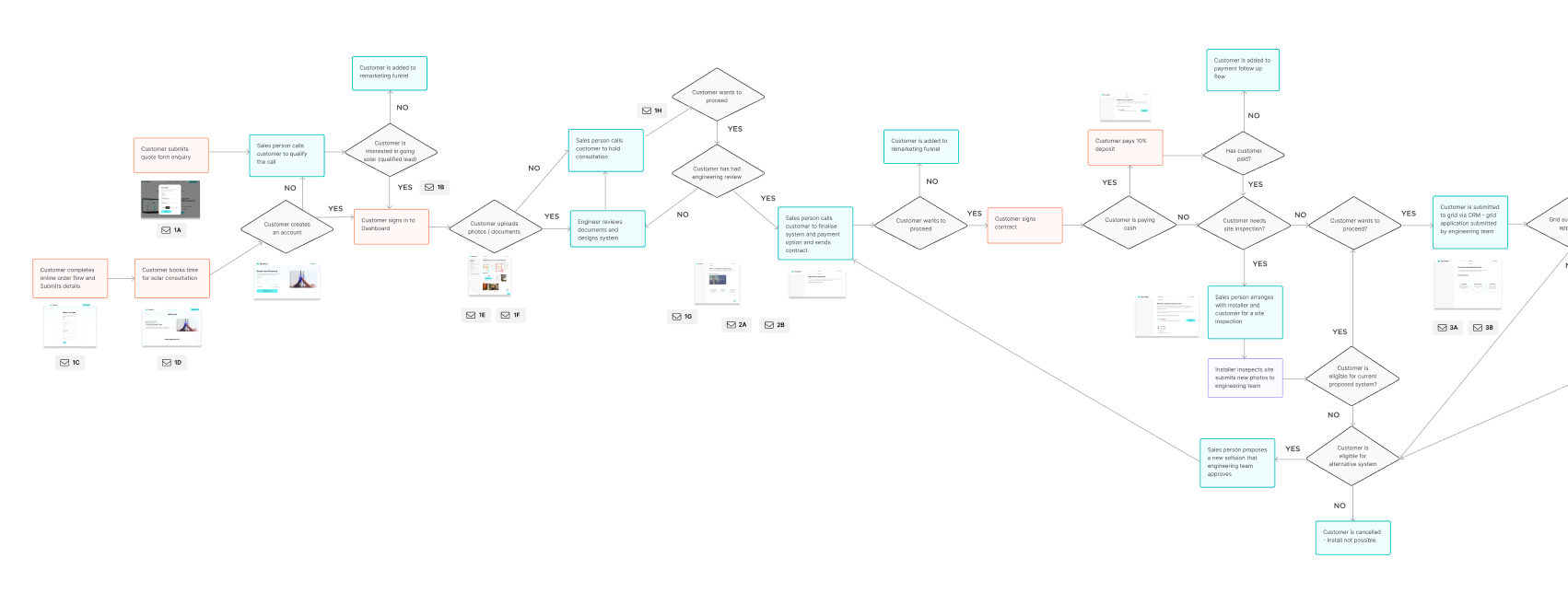
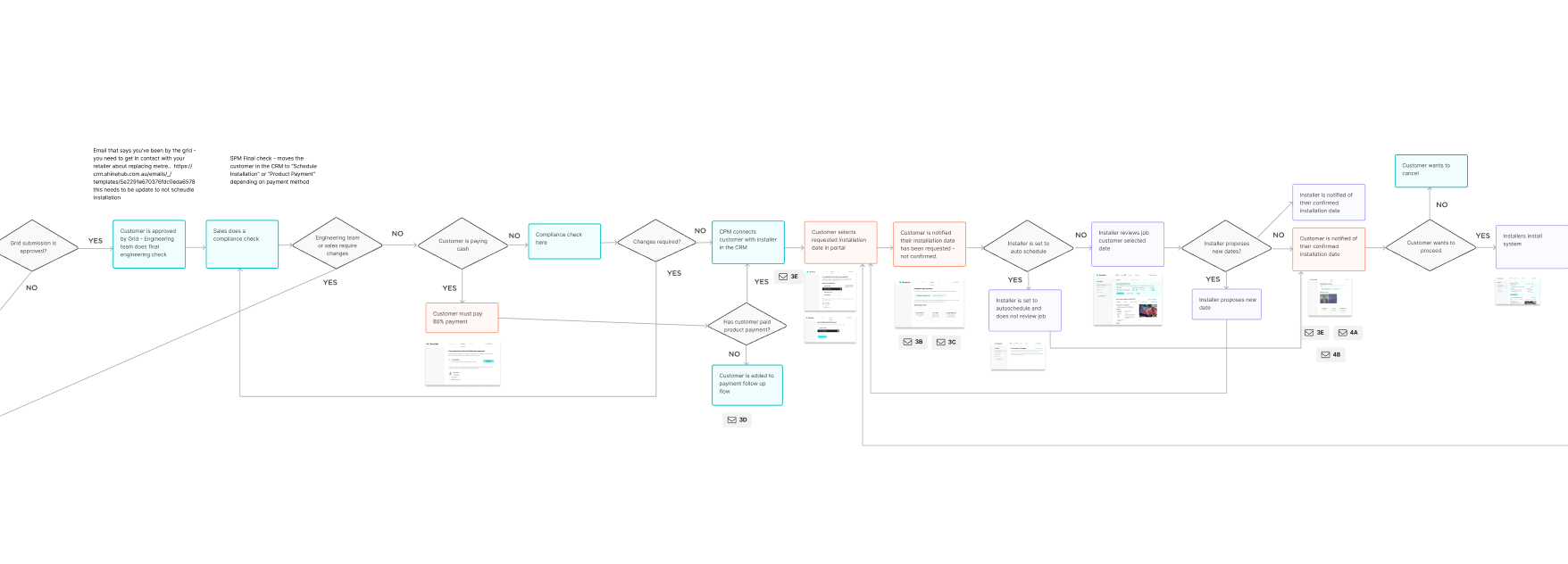
Journey Mapping
Next, combined elements of Service Design where we needed to map out the entire flow for a customer from initial enquiry through to the final stages of installation.
Whilst we were focusing on the stages pre-enquiry, we needed to ensure the entire customer flow was being handled correctly and at each touchpoint with the company, the customers were happy and informed - a critical need that came from the research.
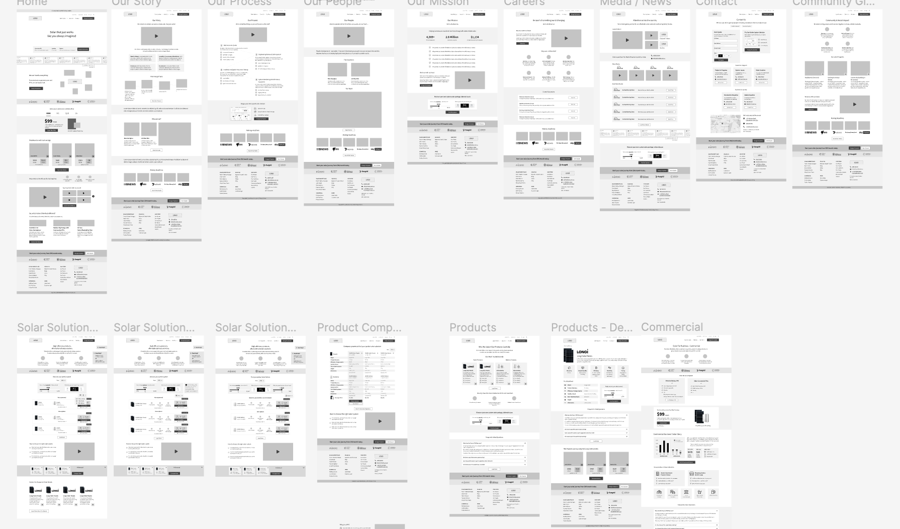
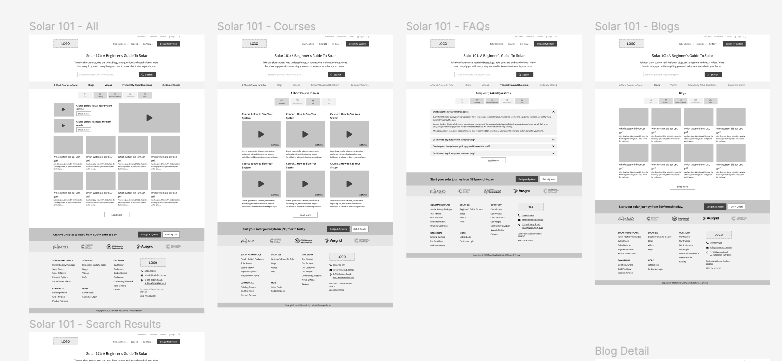
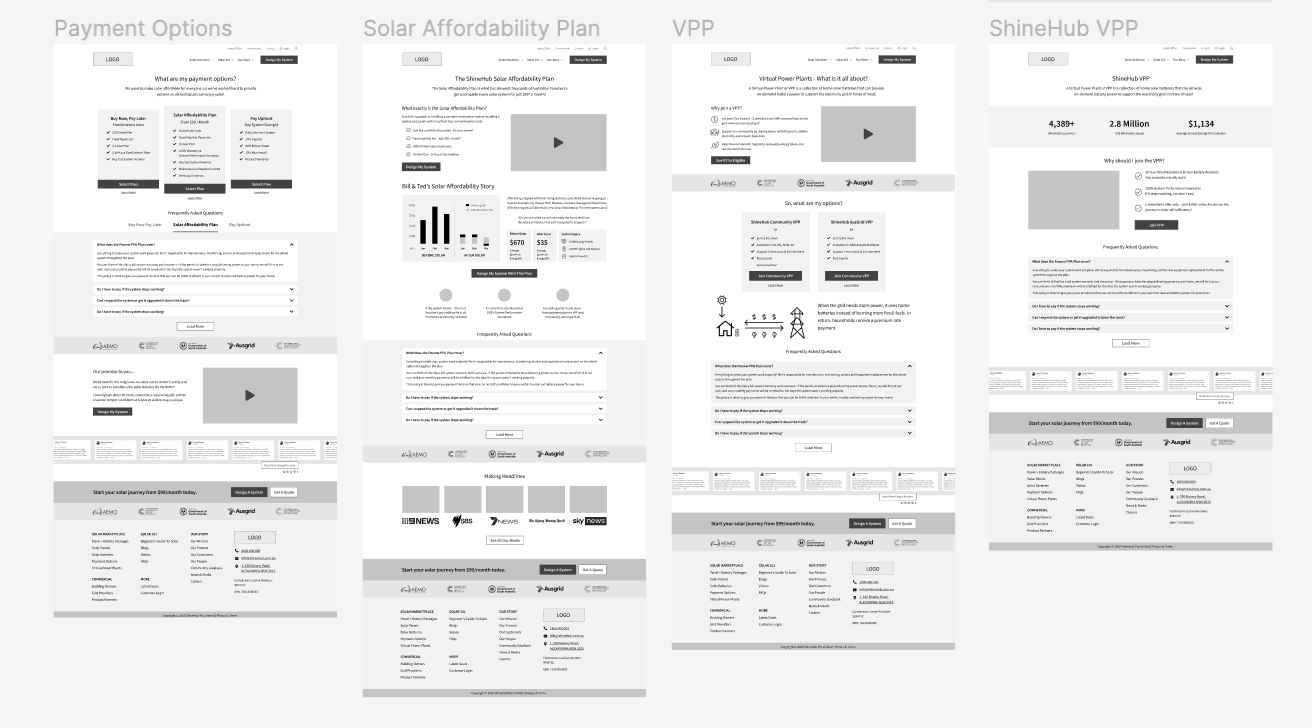
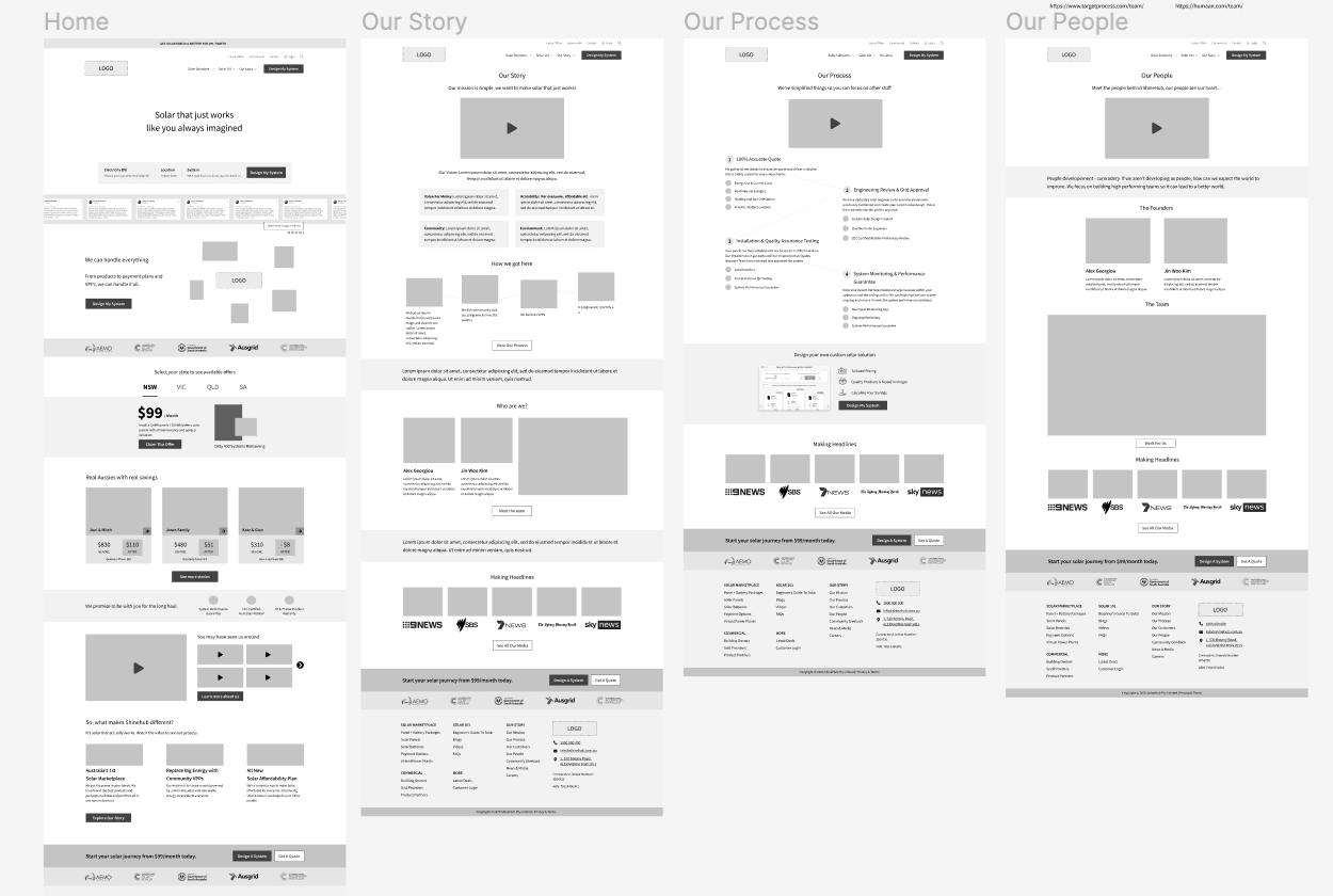
Design - UX Wireframing.
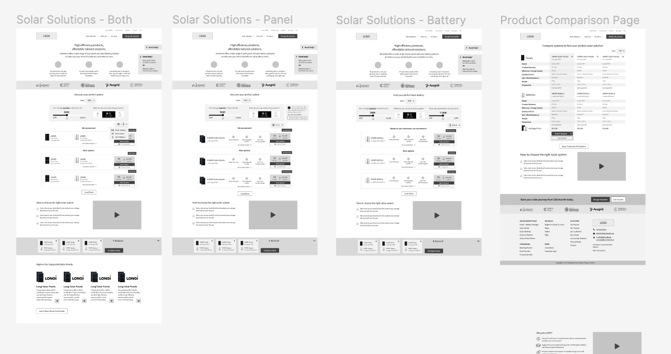
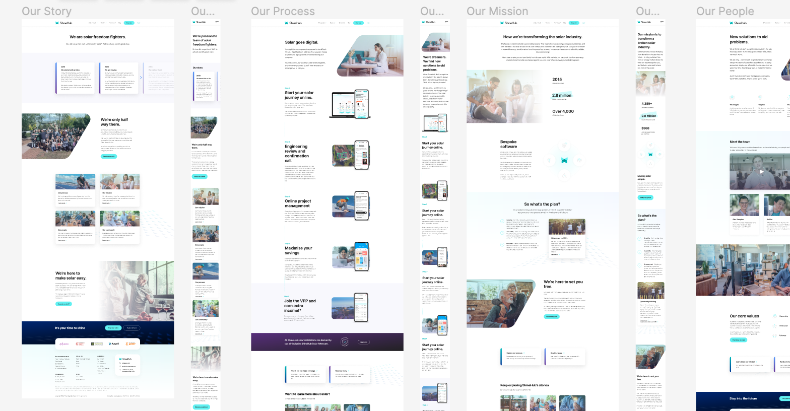
The new site was to be broken into two core parts - the online shop / ordering section, which required significant custom UX and development, and the rest of the site which consisted of less complex widgets and was to be more like a portfolio site to simply show off all the aspects of the organisation About us, blog etc.
Before the research my initial thoughts on the design were much closer to an ordinary ecommerce store. However the overwhelming amount of feedback showed that users needed to rather ‘order their products in a way that was more similar to a more expensive purchase such as booking a flight or accomodation or even a car. My first idea was to create a simple filtering tool similar to Airbnb or a flight selection process whereby a user must input their relevant information to reveal the results best suited to them.
Originally displaying vertically, where users had to scroll down to reveal more results, we decided this method was not as effective as having horizontally displayed results, to allow the user to see more within the screen, yet still discern the separateness of each result.
Initially we wanted to display the benefits of the organisation and show trust factors such as the partnering logos, before the results of the filtering system. However, once designed, displaying all of this information before the key results felt overwhelming and confusing, it distracted from the core task and pushed down the key elements the user should be focusing on.
Version 2 of this page changed drastically - we removed all distractions and cut straight to action. We led the user into a ‘step by step’ flow with no navigation but a simple stepper bar that moved with each interaction.
Design - UI
As the rest of the site came together in wireframes, we jumped into UI design. Here we refined any concepts we came up with in Wireframing stages and developed content and copy to match.
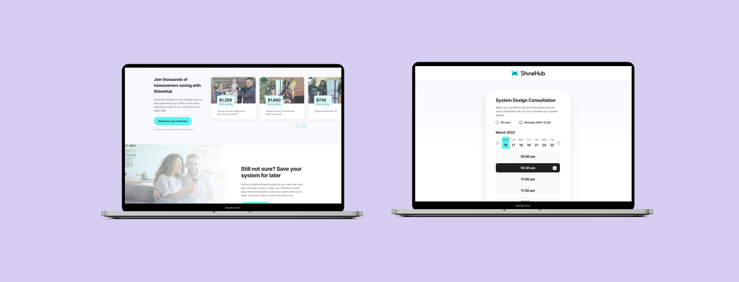
The Summary page was of great importance in the checkout funnel and a final contributor to maximising conversion opportunities. We decided to launch with one version and AB test different elements over the coming months after launch.
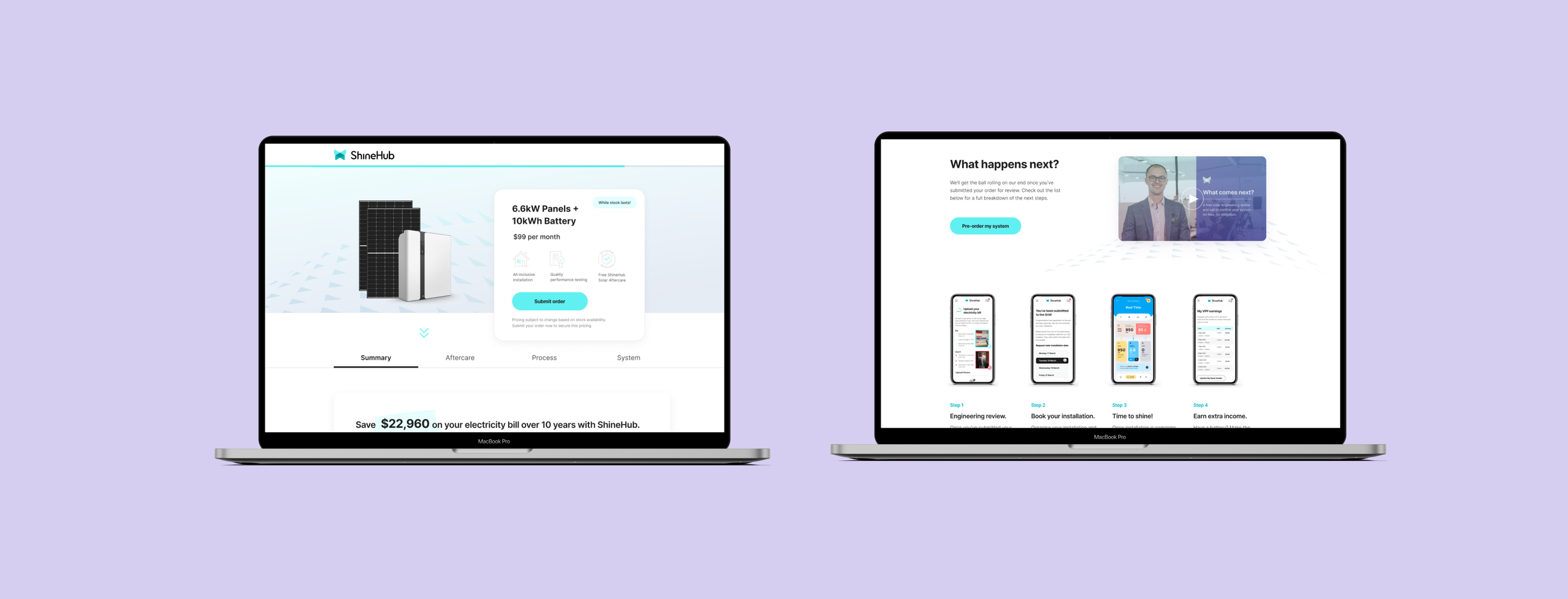
Launch & testing
After several months of research and design work, we went into build. I personally worked very closely with the developers to ensure each element was built exactly to my written requirements. From complex backend engagements through to micro interactions, it was critical to the user experience that the site worked seamlessly and quickly.
We then beta launched to a local council in South Australia, where we held a partnership and event with the mayor and a select group of citizens. After aiming for a specific number of customers for beta, we exceeded expectation with double the amount of users successfully moving through the online ordering flow.
From this initial launch we then began rounds of testing and iteration over the next few months, closely monitoring our testing platforms, heatmaps, recording as well as further usability testing. We then launched to the wider network of Australia with special offers and closely monitored the success of each campaign.
I am very proud of this project as we were able to turn of typically in-person purchasing method into a fully online solution. We continue to relaunch and iterate this system to the present.